

Bunkhouse
-
DM launched a new, camp-inspired brand called Bunkhouse for the gifting market. The goal was to create a line that captured the spirit of summer camp—nostalgic, woodsy, and fun—while appealing to impulse shoppers looking for something clever and giftable.
-
I drew from my own childhood—growing up on a farm, spending summers at camp, and earning scout badges. That experience shaped the look and feel of the brand. The tone was nostalgic and outdoorsy, with a layer of humor woven through illustrations and copy. Colors were pulled from today’s outdoor gear world—earthy but vibrant, familiar but fresh.
-
I created the brand from the ground up, including the logo, illustration system, color palette, typography, packaging, and photography direction. Deliverables featured here include a deck of cards, disposable hand soaps, a first aid kit, and a camp-style floor mat. I art directed myself throughout—conceptualizing, designing, and delivering the full rollout.
-
The brand sparked immediate excitement. A major Canadian retailer bought into the first aid kit right away, and the overall response affirmed the power of playful, well-targeted storytelling. Looking back, I see the value of collaboration and critique—this was a solo effort, but the process reminded me how much stronger work can become when ideas are shared.

CAMP CHARACTERS. Meet the full lineup of custom face cards including Kings, Queens, Jacks, Aces and Jokers. Each character has a personality of its own, from woodland antics to playful props, giving the Bunkhouse deck a spark of mischief and energy.

CAMP ROYALTY. Each King rules his own corner of the campground, from strumming by the fire to paddling across the lake. Built for symmetry and full of character, these cards blend woodland creatures with classic court card structure and a touch of Bunkhouse wit.

QUEENS OF THE WILD. The Queens trade their thrones for adventure. A squirrel uncovers hidden treasures, a deer devours stories, a raccoon rides the waves and a bear reels in a fresh catch. Each card adds movement, humor and a touch of Bunkhouse charm.

JACKS WITH JOBS. No idle royalty here. These Jacks are in motion, planning picnics, mapping hikes, hauling firewood and taking out the trash. Packed with humor and energy, they bring everyday camp life to the deck.

THE ACES. Each Ace distills camp life into a single bold graphic, from sun soaked peaks and sleepy birds to a coiled snake and a heart meets horizon. These symbols set the tone for the entire deck, blending outdoorsy roots with clean, modern design.

STACKED & SNACKED The Jokers pile on the chaos of camp food, with syrupy stacks, ants on the move and towering snacks. Each card is playful, unexpected and full of Bunkhouse mischief.

LET THE GAMES BEGIN. Illustrated with a camp-inspired twist, each card was designed to feel familiar but fresh—from hot dog suits to tent-shaped spades. It’s a full experience in a tin—ready to play, roll, and keep score.
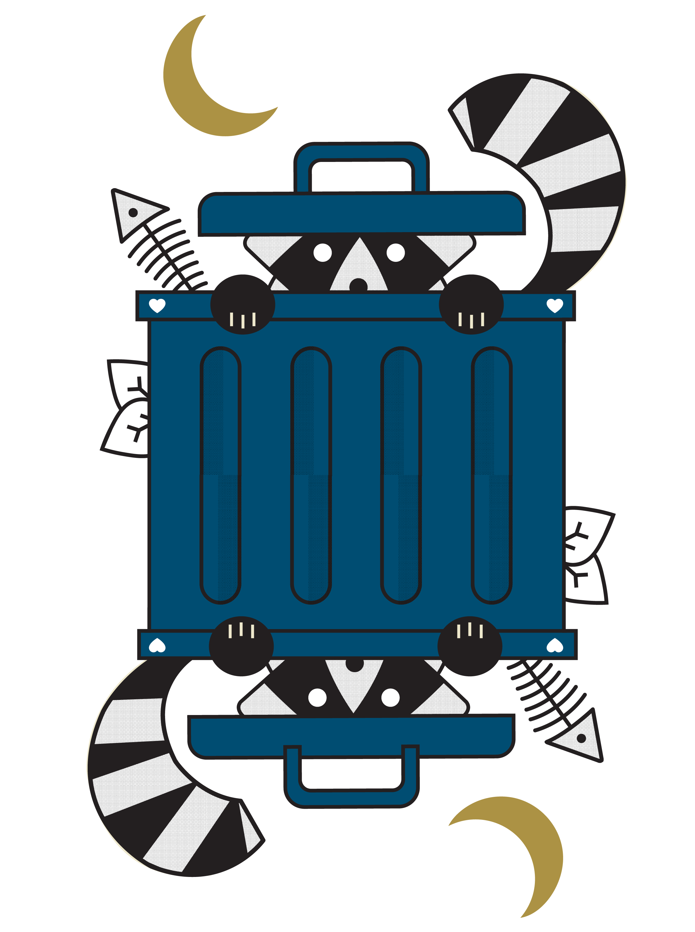
TRASH RACCOON, DEALT. Built for symmetry, this card hides plenty in plain sight—fish bones, leaf litter, crescent moons, and tiny heart pips. Every piece reinforces the brand’s playful spirit and love of small details.

ACE OF SPADES. A standout from the deck, this card pairs classic symbolism with subtle wit. Gold spade scales and a coiled snake hint at the brand’s playful edge while staying rooted in camp tradition.

DECKED OUT. For the tin and card back, I used iconography from inside the deck to create a symmetrical, story-rich pattern—one that nods to the decorative origins of playing cards while clearly communicating what’s inside. A mix of clean outlines, visual texture, and purposeful layout helped tie it all together.

FRONT DETAIL.

UNFOLD THE FUN. Every panel was considered—front, back, sides, and seams. From illustrated card spreads to sticker-style graphics, this flat layout extends the camp theme while giving the full packaging system a sense of movement and play.

READY TO ROLL. The outer case pulls it all together—designed for shelves, road trips, and rainy-day cabins alike. Every detail reinforces the Bunkhouse world: playful patterns, clear function, and just enough grit to feel like camp.

IN-TENTS CARE KITS. Designed for scrapes, spills, and unexpected thrills. Each tin pairs practical first aid with bold colors, campy puns, and outdoor-friendly illustrations—made to stand out on shelves and fit in a backpack.

OPEN FOR EMERGENCIES. Inside, the essentials are neatly packed and ready for action. The design had to work hard—balancing charm with clarity, and making sure the outside felt just as useful as what’s inside.

ART DIRECTION IN ACTION. All photography was produced in house. I developed the creative concepts and provided art direction to ensure the shoot highlighted the kit’s portability and personality, capturing it in a way that felt authentic and on brand.

THE FULL SET. Three kits. Three personalities. One cohesive system built for wherever the trail leads.

CLEAN HANDS, CAMP STYLE. This sub-brand was inspired by the rustic signage and rituals of summer camp. The arched “Mess Hall” label mimics hand-carved cabin signs, while geometric icons—like totem pole motifs—shift with each scent. A sudsy bear adds a playful narrative touch, helping connect scent, story, and function in a compact, trail-ready tin.

WHAT’S INSIDE COUNTS. Biodegradable soap sheets, packed and ready for the trail. Easy to carry, easy to use—just add water.

SCENT WITH A STORY. Each scent tells its own tale—through color, icons, and playful illustration. The bold palette helps scents stand out, while details like the sudsy bear and geometric motifs reinforce the camp-inspired world of Mess Hall.

THE DETAILS MATTER. Even the back tells the story. The playful bear wraps around the label, reinforcing brand continuity while making room for ingredients, scent notes, and essential info—all within a compact, easy-to-read layout.

GROUND COVER, COVERED. From type to texture, this hangtag was designed to feel like camp signage—rugged, clear, and just a little cheeky. Icons, specs, and illustrations keep it informative, while a playful tone (“keep your rear safe from the wild side”) makes it unmistakably Bunkhouse.

CAMP-READY BADGES. These embroidered-style graphics extend the Bunkhouse language into merch, packaging, and product storytelling. Designed to feel like modern camp patches, each one builds on the tone of the brand—clever, nostalgic, and ready for the next adventure.