

Curad Campaign
-
Create a cohesive campaign that reinforces Curad’s brand identity while clearly differentiating bandage types. The visuals and messaging needed to feel approachable, inspiring customers to think ahead and stay prepared.
-
To build recognition and spark connection, I focused on consistency—color, typography, and tone—all anchored in Curad’s signature green. Each product line was distinguished with its own secondary palette and supported by relatable, everyday scenarios. The goal: make the product feel personal, useful, and always within reach.
-
I developed the campaign concept and extended it across PDQs, coupons, ads, and web. I created all the hand-drawn doodles, using them to reflect real-life moments that might call for a bandage. Custom hand gestures were paired with headers to visually reinforce the message—peace signs, stop signs, hang loose, and more. I also art directed photoshoots, collaborated with the creative director and copywriter, and worked closely with the regulatory and digital teams to keep everything on track.
-
The campaign gave Curad a more human touch—one that’s visually distinct and emotionally resonant. The hand-drawn elements and casual typography made the brand feel more relatable, while the structured system helped clarify product choice and use. It’s a system built to stick—with both customers and creatives.

PEACEFUL, EASY PEELING. This PDQ display brings the message to life with bold type, custom hand photography, and doodle-style illustrations that highlight the product’s gentle removal. The interior wallpaper extends the story—playful icons reinforce the “peaceful” idea from every angle.

PATTERN WITH PURPOSE. Each PDQ reveals a custom wallpaper as the product is removed—pairing doodled hand gestures with campaign messaging. It’s a small surprise with big impact, reinforcing the benefit while adding visual interest at shelf.

DESIGNED TO STAND OUT. Placed alongside national brands, the Curad display holds its own with bold color, friendly messaging, and clear product benefits. Even at shelf level, the peace sign and “Truly Ouchless!” message draw attention and support quick decisions in a busy aisle.

BUILT FOR THE AISLE. This display balances shelf impact with clear product education. Bold headers, bright color, and a custom hand gesture draw the eye, while callouts like “no tears” and “EZ Release™” reinforce the key benefit in a friendly, approachable way.

SEEING IT IN ACTION. From concept to cart, the campaign made its way to store shelves with confidence. This endcap execution uses bold visuals and hand-led storytelling to engage shoppers—supported by motion and signage for extra stopping power.

BRAND STORY, CLIPPED CLEAN. This coupon carries the same visual language—bold headline, custom hand gesture, and playful doodles—ensuring the campaign remains recognizable across touchpoints. Even in a small format, the message is clear: gentle, effective, and ready when you need it.

STOP BLEEDING, START CONNECTING. A bold red palette and open hand gesture drive urgency and visibility, while playful doodles reinforce the message with a wink. The visual system stays consistent across the campaign but adapts to emphasize each bandage’s specific benefit—in this case, bleeding control that works fast.

A PATTERN THAT GRABS ATTENTION. Simple hand outlines and bold type repeat the benefit—stop bleeding—without missing a beat. The red-on-red design mirrors the urgency of the product while reinforcing the campaign’s cohesive, illustrative style.

TWO PRODUCTS, ONE STORY. This side-by-side coupon promotes two sub-brands—QuickStop! and Soothe & Cool—using a split-hand concept that highlights each product's benefit. I illustrated the doodles and helped ensure that both sides of the design felt unified while still distinct, visually reinforcing the campaign’s playful tone and product differentiation.

STAY COOL, STAY COVERED. The “hang loose” gesture gives this PDQ a relaxed, confident vibe—perfect for a product that’s all about soothing relief. Paired with turquoise tones, hand-drawn illustrations, and fun copy like “Mr. Blister,” the design cools things down while keeping the campaign’s voice consistent.

STAY COOL, STAY CONSISTENT. Each inner panel is lined with a custom wallpaper featuring playful hand gestures that echo the product message. For Soothe & Cool, the “hang loose” symbol reinforces the lighthearted tone and product benefit—cooling comfort. The illustration style keeps the branding cohesive while adding surprise and personality to the unboxing experience.

STAY IN THE GAME. Built for tough players and tougher injuries, this display pairs bold, high-contrast visuals with sporty, action-driven doodles. The black and yellow palette commands attention, while the hand gesture—gripping a baseball—drives home the product’s durability and focus on performance.

DOODLES IN MOTION. Hand-drawn line art supports the theme of movement, energy, and play—skateboards, cleats, and arrows weave between the copy and product, reinforcing the idea of staying active and protected. The doodles are fun but purposeful, aligning with the campaign’s tone and helping build category clarity at shelf level.

LINEWORK THAT PLAYS ALONG. A custom pattern reinforces the core message with playful illustrations of hands and baseballs in action. The yellow-on-black palette is bold and energetic, mirroring the extreme performance of the bandages themselves—built to move, hold, and stay in the game.

GOTCHA COVERED. This full-line ad pulls together every product in the Curad campaign using color-coded branding, hand-drawn doodles, and a bold “Gotcha Covered” headline. Each sub-brand is anchored by its own icon and tagline, making the benefits easy to identify at a glance—while reinforcing the overall visual system across all categories.

A SYSTEM THAT STICKS. Each icon reinforces its bandage’s benefit at a glance—Truly Ouchless, Performance Series, Quick Stop, and Soothe & Cool. Consistent in style and color, they carry across all packaging and displays to help shoppers navigate the shelf, build recognition, and trust the difference.

BRINGING THE BRAND ONLINE. The campaign extends seamlessly to digital, with each sub-brand featured on Curad’s website using its signature colors, iconography, and messaging. I partnered with web designers to ensure the design remained cohesive across platforms—building recognition and reinforcing each product’s unique benefit.
Curad
-
Design a range of retail-ready bandage boxes that clearly communicate product function, reinforce brand identity, and stand out on shelf.
-
Each box needed to be instantly recognizable and easy to navigate. Logos, color, typography, and iconography were developed to support both the sub-brand and parent brand, while maintaining visual cohesion across the full product line..
-
I created the concepts, logos, and graphics and art directed the execution. I collaborated closely with the VP of Creative, Creative Director, designers, copywriter, regulatory, and vendors to ensure each design met brand standards, regulatory requirements, and production needs.
-
Retail packaging was successfully delivered across multiple SKUs, reinforcing Curad’s identity at shelf level and supporting product clarity and differentiation across stores nationwide.

A TREAT FOR EVERY SCRATCH. Inspired by a bakery storefront, this playful packaging uses bold colors and sweet visuals to appeal to younger audiences. I developed the concept, custom logo, illustrations, and bandage designs.
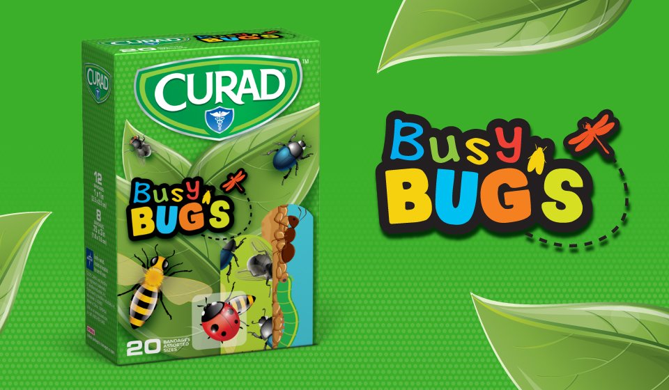
BUGS THAT BANDAGE BETTER. Designed to spark curiosity, this concept brings bold color, movement, and personality to the shelf. I created the logo, graphics, and bandage illustrations to engage kids while reinforcing the Curad brand.

WHO’S READY TO HEAL? This owl-themed packaging tapped into a major trend, creating a whimsical unboxing moment for kids. I developed the concept, graphics, custom logo, and illustrated bandages to deliver a cohesive and engaging experience.

🎶 OPEN SESAME TO HEAR ELMO TALK. Inspired by musical greeting cards, this interactive concept brought Elmo to life through sound. The lid flips open to play the Sesame Street theme—turning a routine purchase into a moment of joy. I led concept development and art direction.

SESAME STREET RETAIL PACKAGING. I partnered directly with Sesame Street to develop this kid-friendly packaging for retail. The bright colors, familiar characters, and playful layouts were designed to catch attention and feel instantly recognizable to children and parents alike.

TRULY OUCHLESS! LOGO DESIGN. The branding strikes a balance between calm and cheerful. I chose a rounded, welcoming font and added a winking smiley to convey ease and comfort—reassuring customers that these bandages are gentle, especially for little ones.

TRULY OUCHLESS! BANDAGE SYSTEM. I created the concept and logo, then worked cross-functionally to bring the system to life. From art directing illustrations to aligning with regulatory and vendor teams, I ensured every detail—from form to function—was accurate, cohesive, and ready for shelf.

SOOTHE & COOL LOGO. Designed to reflect the product’s calming properties, this logo uses a cool-toned gradient and bold, rounded letterforms to convey relief, trust, and modernity. The geometric pattern adds a subtle sense of structure and innovation.

CURAD SOOTHE & COOL BANDAGES. These clear gel bandages use instant cooling technology to provide fast relief for burns, blisters, and bug bites. The packaging highlights the cooling effect with fluid visuals and clean typography. I created the logo and collaborated with the team to ensure clear communication of benefits at shelf level.

CURAD PERFORMANCE SERIES. Designed for athletes and active lifestyles, these bandages stand up to tough conditions. Bold colors, gritty textures, and dynamic type reinforce the durability and protection message. I developed the concept, selected the color palette, guided illustration, and handled production across all original SKUs.