

Skintegrity Tradeshow
-
The goal was to create a product-led tradeshow experience that guided visitors through the three pillars of skincare—prevention, nourishment, and treatment.
Skintegrity needed to inform, engage, and clearly communicate how Medline’s products support each stage of care, while making the journey easy to navigate and visually memorable.
-
I built the system around a simple, powerful symbol: the triangle. Representing the three pillars of care, it appears throughout the space to create structure and consistency.
Bright colors and clean typography gave the system energy and warmth, helping the brand feel modern, clear, and approachable—even in a clinical setting.
-
I created the Skintegrity logo, visual identity, and all supporting materials for the tradeshow. This included graphics, banners, printed collateral, and wayfinding elements.
I collaborated with the VP of Marketing, Creative Director, copywriter, regulatory team, vendors, and fellow designers to ensure everything was delivered on time and aligned to brand.
-
A cohesive tradeshow system that made the experience easy to navigate, visually engaging, and strategically aligned with Medline’s skin health messaging.

THE LOGO. Each color in the Skintegrity logo represents a pillar of care—purple for prevention, blue for nourishment, and green for treatment. When combined, they symbolize Total Skin Health. The full-color mark reinforces the message: complete care comes from all three working together.

THE PASSPORT. Designed as both a guide and lead-capture tool, the Skintegrity passport helped visitors navigate the three pillars of Total Skin Health—while offering reps a way to follow up post-show. Inspired by macro views of skin, the triangle shape reflects the interconnected strength of the skin barrier. It also ties directly to Skintegrity’s three pillars: prevent, nourish, and treat. Bright, energizing colors reinforce movement, science, and care in action.

PASSPORT UNFOLDED. The interior layout guides visitors through the three core stages of skin health, ending with a built-in lead capture form for sales follow-up. Bright colors and structured messaging keep the experience clear and energizing.

PASSPORT FOLDED. Closed and stacked, the triangular format reinforces Skintegrity’s identity and grabs attention on the show floor. Designed to be both functional and visually striking—even before it’s opened.

THE DIELINE. I created a custom dieline for the passport, working closely with the vendor to ensure it folded cleanly and laid flat. The biggest challenge was designing the artwork flow—making sure the content unfolded in the right order and maintained clarity at every step.

PASSPORT STAMP. As visitors explored each of the three skincare pillars, their passports were stickered along the way. Collecting all three stamps entered them into a spa gift card drawing—boosting booth traffic, encouraging full engagement, and generating valuable leads for the sales team.

GUIDED BY DESIGN. A portable piece that brought structure, clarity, and visual cohesion to the tradeshow experience.

A SOOTHING INCENTIVE. To encourage deeper engagement, attendees who completed the Skintegrity passport were entered to win a SpaFinder gift card—an inviting reward that mirrored the event’s message of care, wellness, and total skin health.

WAYFINDERS Designed for intuitive navigation, each poster and banner featured a bold triangle to signal booth zones—helping visitors quickly orient themselves within the experience. This visual cue echoed the Skintegrity brand’s core triangle motif, reinforcing the connection between environment and message.

VISUAL CLUES, CLEAR PATHS. Each poster/banner was paired with a bold, color-coded triangle that aligned to its pillar—Prevent, Nourish, or Treat. This simple visual system helped visitors instantly connect product benefits to their place in the Skintegrity framework.


THE BUILDING BLOCKS OF SKINTEGRITY. Inspired by the structure of skin at the cellular level, the visual system used color-coded triangles to define Skintegrity’s three pillars—Prevent, Nourish, and Treat. Each section featured a distinct palette and callout text to create clarity, flow, and brand cohesion across all printed and digital materials.

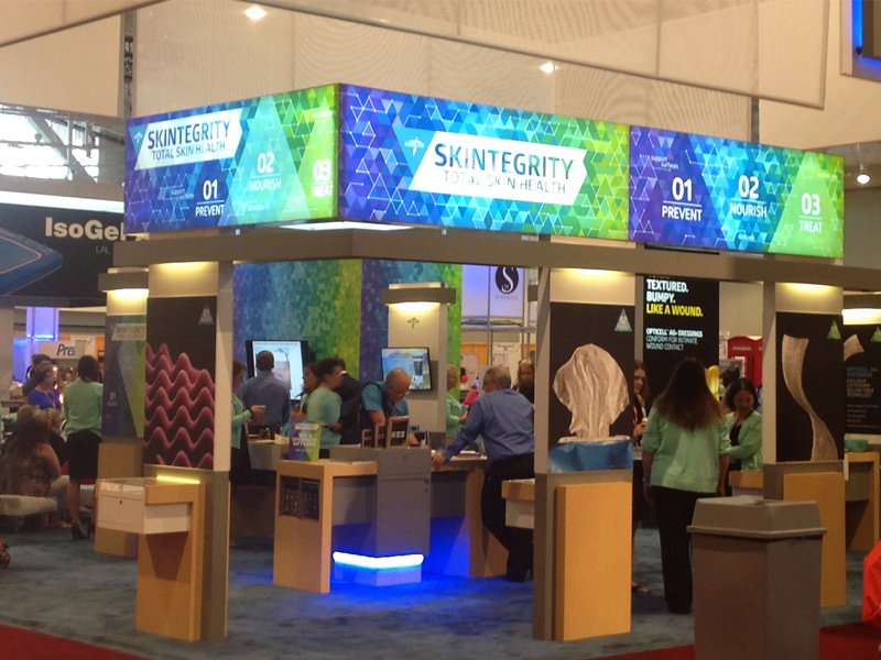
THE BRAND, FRONT AND CENTER. Positioned above the booth for maximum visibility, the Skintegrity banner introduced the Total Skin Health message at a glance. Its vibrant gradient and geometric motif immediately signaled energy, science, and structure—setting the tone for the entire experience below.

A FULLY IMMERSIVE EXPERIENCE. At the show, the system came to life through a 360-degree booth environment. Overhead signage, posters, and hands-on stations reinforced the three-part structure of Skintegrity, making the brand easy to navigate—and hard to miss.
FROM CONCEPT TO COMPONENT. Artwork was applied across booth surfaces, from wall graphics to handouts and display panels. The modular system made it easy to unify messaging while giving each product zone a clear, focused identity—all built around the Skintegrity triangle motif.

PATTERN WITH PURPOSE. This custom graphic extended the Skintegrity brand into an immersive, structural element. Using a continuous triangle motif, the design connected the three pillars of care—Prevent, Nourish, Treat—into a seamless visual story.

BRINGING THE WALL TO LIFE. Applied as a full-height wall wrap, the pattern added energy and cohesion to the booth. It framed product stations, reinforced navigation, and helped turn the space into a dynamic extension of the Skintegrity brand.