

Package Thinking
-
A curated collection of packaging work—each piece crafted to balance form and function while telling a distinct brand story. Most projects shown here were developed through to production, with a few early concepts included to showcase breadth. From pitch to press, every solution is rooted in design thinking and hands-on execution.

RETAIL PACKAGING FOR PHONE ACCESSORY. This concept was designed to help a health-conscious startup stand out on shelves with a unique dieline, bold typography, and high-contrast color blocking. The triangular structure and angled windows were inspired by the geometry of shields and the natural texture of minerals—tying into the product’s germ-blocking capabilities. A limited palette of chartreuse, black, and copper tones was chosen to feel both energetic and clinical, with neon accents that signal innovation. Typography leans sharp and modern to echo the product’s promise of cutting-edge protection.

ON THE GO BRIEFS. A discreet solution for unexpected moments. This concept pairs a small disposable undergarment with a travel-friendly carrying case—designed to blend in, not stand out. Inspired by luggage tags and herringbone textiles, the look feels purposeful, private, and polished—providing confidence and comfort when customers need it most.

MEDLINE NEBULIZER SYSTEM. Created a unified look across multiple items by developing a flexible system of color, graphics, and product imagery—making the packaging both clear and approachable.

AEROMIST BUDDIES – MONKEY. Extended the line with a second character-driven design, keeping the system cohesive while giving each item its own playful personality.

CAPTURING CLARITY THROUGH PHOTOGRAPHY. To help customers better understand the product, I directed photography that showed the nebulizer mid-use—highlighting vapor, condensation, and real-world function. I also styled a curated flat lay of every component inside the box, ensuring clarity and confidence at shelf.

AEROMIST BUDDIES – FISH. Designed to be more approachable for kids—friendlier type, bolder colors, and simplified graphics to reinforce the character-forward design.

FULLY BUILT-OUT DIELINE. This final dieline shows how the design system extends across all panels—balancing bold visuals with product clarity, playful icons, and consistent branding.

CUSTOM ICON PATTERNS. Each Aeromist Buddy was paired with a playful icon that reinforced the character and added personality to the packaging. The icons created a sense of fun while helping distinguish between each item at a glance.

FULLY BUILT-OUT DIELINE. This final dieline brought together every visual and functional detail—from side panel vapor shots to clear item callouts on the back. Color blocking was refined to highlight the product while maintaining visual consistency across the line. The result is a bold, shelf-ready system that’s easy to understand, easy to differentiate, and easy to trust.

UNIFIED SYSTEM, BOLD EXPRESSION. A compact product line with a big visual punch. I created a cohesive packaging system for Aeromist Colors that emphasized each item’s individuality while maintaining brand consistency across the range.

DESIGNED TO TRAVEL WELL. This compact design needed to quickly convey portability—so I leaned into real-life context. I styled and directed a lifestyle-inspired shot featuring keys and a travel bag to reinforce size, simplicity, and on-the-go use without needing extra explanation.

CONSISTENCY ACROSS EVERY PANEL. To keep things clear and cohesive, I established a unified layout system—consistent framing, background color, type treatment, and scale—across all sides of the package. Every panel works on its own, but together, they deliver a complete story at a glance: what’s inside, how it works, and how it’s used.
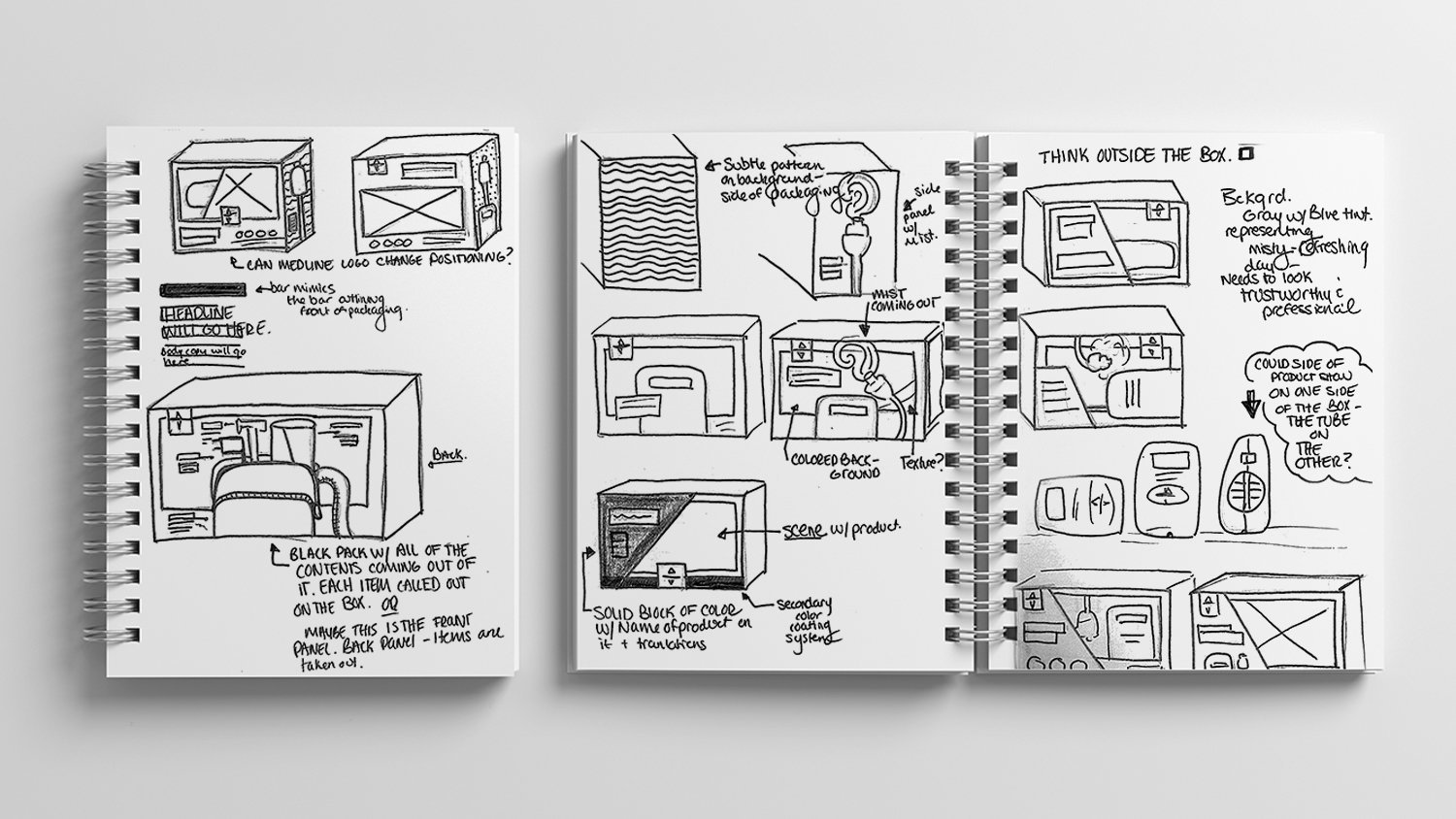
EARLY PACKAGING CONCEPTS. Initial sketches explored layout, messaging, and structure—helping define how the product could live on shelf and communicate clearly. These early ideas informed the dieline, hierarchy, and design system that followed.
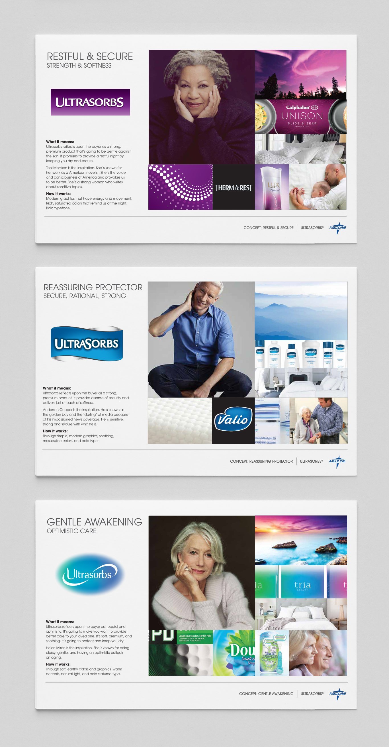
ULTRASORBS MOODBOARDS. Three distinct moodboards were developed to help define the tone of the brand. Each one explored a unique emotional direction—pairing imagery, color, and texture to express comfort, confidence, or care. These boards laid the foundation for the final packaging system and guided early creative conversations with the client.

ULTRASORBS TRIAL PACK. Trial packaging for a retail launch. Balanced high-impact claims with professional restraint to reinforce trust, absorbency, and category innovation.

ULTRASORBS DRY PADS. Developed the full packaging system for Ultrasorbs®—including logo design, layout, and art direction. The goal was to balance performance messaging with professional polish. Illustration by Michael Bast.

REMEDY DERMATOLOGY CONCEPT LINEUP. A collection of design directions created to help evolve the Remedy Dermatology packaging system. Each explores a unique voice, while maintaining brand equity through structure, color, and tone.

THE FOUNDATION OF A BRAND. This redesign set the tone for all future Medline packaging. Inspired by sleek consumer brands like Apple and headphone packaging, it used simplicity, bold color, and clean hierarchy to modernize the brand and create a more intuitive customer experience. The final design became the blueprint for Medline’s current packaging system.

DESIGN IN EVERY DETAIL. The challenge: show the full stethoscope at scale without losing clarity. The solution: split the design across front and back—head on one side, ears on the other—paired with a heartbeat graphic that adds context and energy.

FROM FLAT TO FINISHED. This dieline brings every detail into focus—from layout and imagery to labeling and compliance. The front and back work together to show the full product without shrinking it down, while the color-coded system and clear hierarchy ensure each item is clearly identified and consistent across the line.

DESIGNED TO SCALE A quick glance shows how the stethoscope line expanded under the new Medline system. Color cues indicate function and price tier, helping customers easily navigate and choose the product that best fits their needs.

READY TO GROW (AND GIFT). The windowed design lets the product—and pattern—shine. Every element of this package was built to feel thoughtful and cohesive, from the floral framing to the label system and seed-inspired names. Designed to feel like a keepsake, not just a toolset.
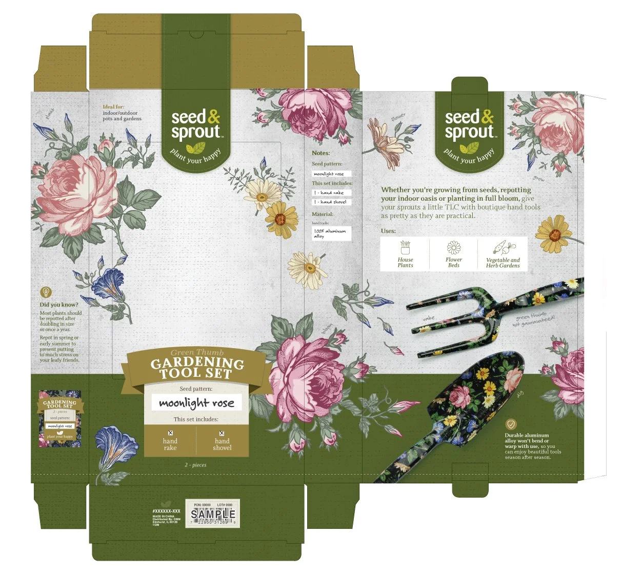
WHERE FORM MEETS FLORAL. This boutique-inspired box wraps durability in soft details. From the color story to the pattern pairing, every choice was made to elevate utility into something beautiful. Packaging, layout, and supporting graphics were crafted to feel giftable, garden-ready, and true to the “plant your happy” spirit.

THOUGHTFUL INSIDE AND OUT. This exploded view highlights the dieline, insert system, and custom print wrap—bringing durability and delight into every layer of the experience.

PATTERN-DRIVEN PRESENTATION. These seed-inspired graphics were created to call out the coordinating tool patterns and tie the set back to the garden. From romantic florals to fresh greens, each label uses color and texture to distinguish the theme while keeping the branding consistent and giftable.

GARDEN-READY FROM THE INSIDE OUT. From the hand-illustrated tin to the custom-stamped stakes, every detail was designed to charm. I developed the packaging, branding, and product elements—including pencil colors, wood graphics, and patterned wrap—to create a cohesive, giftable set that feels thoughtful and fun from shelf to soil.

EVERY DETAIL, DOWN TO THE ROOTS. I led the packaging layout, dieline design, and overall product presentation—tying together branding, color, and messaging. The botanical wrap adds visual charm, while the structure and labeling make the kit easy to merchandise, gift, and enjoy season after season.

DESIGNED TO KEEP (AND KEEP USING). I developed a reusable tin that feels both giftable and garden-friendly. The custom wallpaper wraps the lid in organic charm, while the matte base and soft script reinforce the calming tone of the brand. Durable, sustainable, and made to last season after season.

COLOR THAT TELLS A STORY. Each tin in the series uses the same custom illustration, but a unique color palette to express tone and personality. I selected colors to feel earthy yet elevated—ensuring every version looked great on-shelf, online, or gifted in the garden.

FRESH PICKS FOR GREEN THUMBS. These cheerful gloves mix garden-ready function with playful pattern. Each seed-inspired print pairs back to coordinating tools, bringing extra joy to everyday tasks.