

Logos
-
A curated collection of logo work—each mark built to reflect a core idea, value, or personality. Some were designed as part of full-scale branding systems, while others were quick-turn concepts or part of broader packaging programs. What they share is a foundation in thoughtful design, with attention to voice, versatility, and storytelling.

AWAKEN: BRANDING A BREAKTHROUGH IN SKIN HEALTH. A developer of the #1 skin care brand in healthcare created a three-tiered program designed to help skin look and stay beautiful—starting with a brand identity that felt elevated, trustworthy, and rooted in care.

STANDING OUT WITH SCIENCE AND STYLE. To cut through a crowded skincare market full of claims and confusion, this concept used bold contrast and unexpected pattern to deliver a sense of energy, innovation, and science-forward confidence.

SOFT LINES, STRONG IMPRESSION. This mark leans into softness and emotion—using organic curves and rich color to suggest human touch, skin health, and a more personal, sensory approach to science-backed skincare.

DESIGN THAT MAKES YOU LOOK TWICE. Each logo explored a different tone—structured, bold, expressive—but all were designed to break the mold and connect through color, form, and feeling. A visual system built to surprise, inspire trust, and energize the category.

LOGO EXPLORATION: SOFT SHAPE, STRONG ENERGY. This concept was built for the active clinician—vital, driven, and always on the move. Curved letterforms and a flowing ligature bring movement and femininity, while the bright pink adds vibrancy and energy. The circle container softens the mark, reflecting a balance of strength and approachability.

DESIGNED FOR DIRECTION. Short for “avenue,” this mark was built around movement, confidence, and clarity. Bold geometry, connected letterforms, and a directional container give the logo strength and flow—while the vibrant green nods to signage, progress, and unisex appeal. The result feels modern, approachable, and built for professionals who know where they’re going.
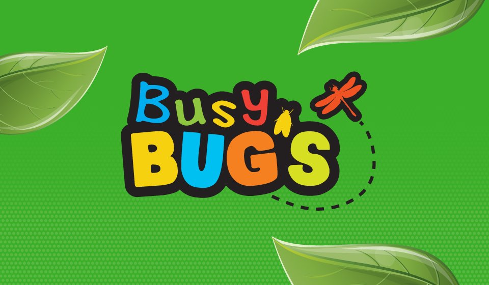
BUSY BUGS. Part of Curad’s kid-focused line, this playful logo was designed to capture young imaginations while standing out on shelf. The bright colors, chunky letterforms, and friendly insect illustrations bring energy and movement—making the brand feel as lively as the little ones it supports.

CUPCAKE COVERS. A sweet addition to Curad’s product family, this logo was created for a specialty kids' bandage line. The soft palette, rounded shapes, and playful typography channel the charm of a cupcake shop—adding delight and comfort to everyday care.

SOFT CARE, STRONG STRUCTURE. This logo leans into approachability with rounded letterforms and a supportive smile-shaped underline. The leaf detail ties back to nature and gentleness, making it feel right at home in a healing environment.

CLEAN LINES, MODERN MEDICAL. With its minimalist, geometric construction, this version communicates efficiency and trust. The streamlined shapes give it a clinical edge—balancing clarity with a fresh, future-forward tone.

A NOD TO HERITAGE. Inspired by traditional healthcare branding, this version introduces a touch of formality and polish. The deep blue and beveled shape suggest legacy, while soft curves maintain a sense of comfort and care.

BUNKHOUSE BRANDMARK. Built for adventure, this camp-inspired logo blends retro badge styling with bold geometric shapes and vibrant color. The goal was to spark nostalgia and energy—something that feels just as at home on a tag, patch, or enamel mug. Every element reinforces the outdoorsy spirit and playful confidence of the brand.

SEED & SPROUT. The name says it all—cheerful, garden-ready, and rooted in joy. I developed this logo to feel friendly, flexible, and natural, with soft typography, warm greens, and a stitched tag motif that feels handmade. It invites play, gifting, and curiosity—just like the products inside.
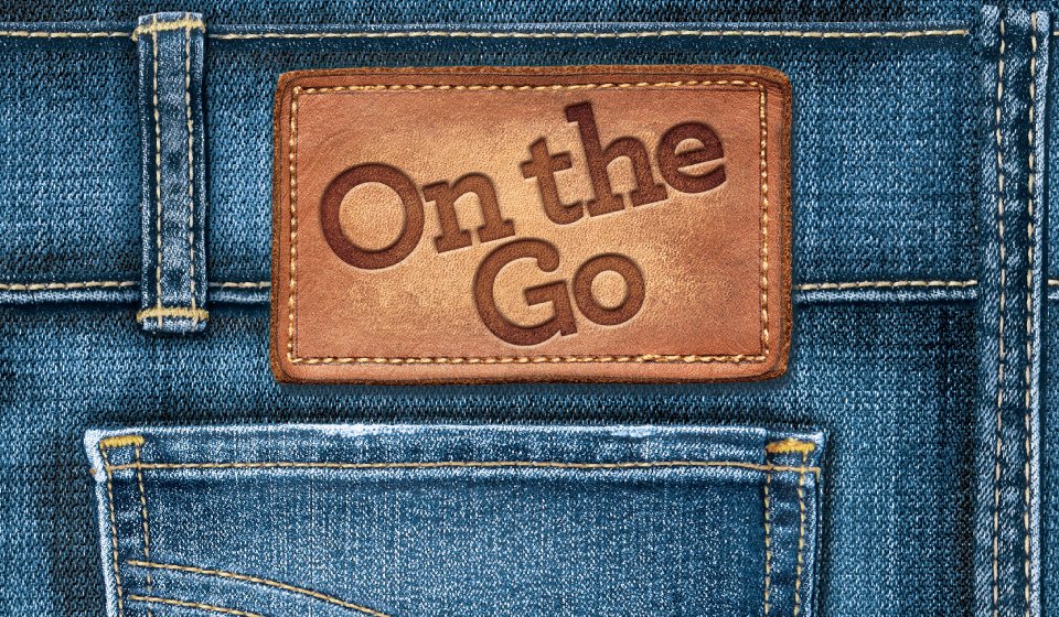
ON THE GO. A discreet disposable brief, rebranded with dignity and confidence. This logo concept takes cues from denim’s everyday familiarity—offering a sense of style, utility, and subtle strength. Designed to blend in, not stand out, it helps users feel comfortable and empowered wherever the day takes them.

LONGLEAF WRITERS CONFERENCE. Designed to celebrate a decade of creativity, community, and craft. This commemorative mark blends literary symbolism with organic growth, nodding to both the conference’s roots and its evolving story. Clean lines, intertwined leaves, and an embedded “10” create a badge that feels classic, commemorative, and unmistakably Longleaf.

ULTRASORBS LOGO DESIGN. A new logo built from the ground up to emphasize protection, reliability, and high performance. The drop icon highlights absorbency, while the bold type and clean gradient suggest strength and clarity. The deep plum and silver tones convey trust and quality—supporting the brand’s promise of unbeatable dryness and protection.

EASY BATH LOGO DESIGN. Designed for convenience and care, this logo uses bright, approachable lettering to reflect the product’s purpose: effortless cleansing without water. The hand-lettered look brings a friendly, personal feel, while the lime green and deep blue combo pops on-shelf and aligns with hygiene and freshness cues.