

Hardware Tradeshow
-
Create a standout visual campaign for Medline’s presence at the National Hardware Show—one that speaks to tradeshow attendees in the home improvement and DIY space while highlighting the relevance of medical supplies in their day-to-day work.
-
We leaned into the language of construction—blueprints, tools, and typography with a structural edge—to connect with the audience on familiar ground. The phrase “Oops. Ouch. Ahh.” distilled the product story down to a relatable sequence of events, making it quick to grasp and hard to forget.
-
I developed the core concept and designed the banner series and supporting sell sheet. Working closely with a copywriter, I aligned visuals and messaging to ensure clarity and impact. I also partnered with the tradeshow manager and print vendor to make sure every element was produced and delivered on time.
-
The campaign drew attention on the show floor and helped reps have more meaningful conversations with attendees. By connecting the dots between injury and recovery, we positioned Medline’s products as must-haves in the world of hands-on work.
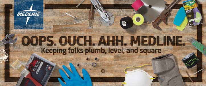
EARLY CONCEPT: BUILT FROM THE BENCH UP. This initial direction leaned into rugged texture and jobsite realism. The workbench-inspired backdrop, singed typography, and scattered tools told a relatable story—connecting medical supplies to the everyday hazards contractors face. A more tactile, weathered look grounded the concept before the final blueprint direction was chosen.

IDEAS ON PAPER. The concept started where most good ones do: with a sketchbook and a sharp pencil. From spatial planning to banner mockups, these early drawings helped map out the blueprint theme—both literally and visually. Each page captures part of the thinking that brought the “Oops. Ouch. Ahh.” experience to life.

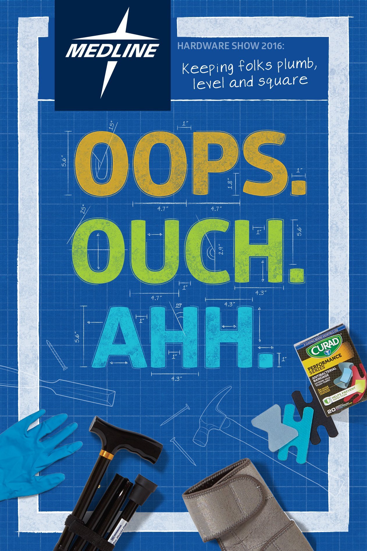
OOPS. OUCH. AHH. The main booth banner introduced a clear, memorable framework—grouping products into three relatable categories: protection, relief, and support. Designed to feel like a technical drawing, the blueprint aesthetic grounded the concept in a jobsite environment while reinforcing brand and product clarity.
TRADE SHOW GRAPHICS THAT SPEAK THEIR LANGUAGE. Blueprint visuals, tool silhouettes, and rugged textures made this campaign instantly relatable to hardware pros. I created the concept, collaborated with a copywriter, and handled design and production to ensure every detail hit the mark—down to the “Oops. Ouch. Ahh.” punchline

OOPS • MESSES HAPPEN. For dirty, drippy, dusty job sites—this section highlights the PPE essentials your crew needs to stay protected from head to toe. Gloves, masks, and shoe covers help keep messes contained and workers clean.

OUCH • ACCIDENTS COVERED. Cuts, sprains, and scrapes are part of the job. This section showcases wraps, braces, and first aid essentials that provide quick relief and help teams bounce back fast—because the work doesn't stop for a little pain.

AHH • BACK ON YOUR FEET. Support when and where it’s needed most. From canes to grab bars, this section focuses on recovery and mobility—helping folks regain confidence after a fall, injury, or unexpected setback.

TOOLS DOWN, NOTEBOOKS OPEN. Designed to mirror a real worksite field book, this branded sell sheet divided Medline products into memorable categories: Oops, Ouch, and Ahh. It let customers take notes, check off needs, and connect medical solutions to everyday mishaps—all while keeping messaging cohesive and easy to grasp.

TYPE THAT HITS HOME. To bring the “Oops. Ouch. Ahh.” messaging to life, I customized Medline’s corporate font with rough textures, blueprint measurements, and an engineered outline. The result? Typography that felt right at home in a workshop setting—relatable, rugged, and instantly recognizable.