

History Wall
-
Medline had just relocated and wanted to create an inspiring, design-forward space for employees and guests. I was asked by the VP of Creative to develop a large-scale history wall that would capture key moments from the company’s 100+ year timeline—celebrating innovation, legacy, and growth.
-
Working directly with the VP, we sketched through initial ideas and explored how to represent both time and progress visually. I began collecting source material from Medline’s archives, including brochures and ads dating back to the 1960s. From there, I translated our ideas into a modern, tile-based layout that allows each moment to speak for itself while building toward something bigger.
I used a blue gradient to create a sense of movement and continuity, echoing the brand and symbolizing forward momentum. The typography and composition were designed to feel architectural and enduring—much like the company itself.
-
• Concept development and sketching
• Tile layout and composition in Illustrator
• Archival photo selection and curation
• Custom typography and illustration
• Art direction and production setup -
The final installation features 56 individual tiles, each highlighting a milestone in Medline’s story. As the years progress, so do the number of tiles—visually reinforcing a message of consistent growth. Blank tiles at the end hint at what’s next, positioning the company as future-ready and still evolving.
The wall became a focal point of the new space—used as a conversation starter, a brand storytelling tool, and a source of pride for employees and leadership alike.

DESIGNING A LEGACY IN TILE. A visual timeline celebrating over 100 years of Medline’s innovation and growth. Each of the 56 tiles tells a story—from pivotal products to major milestones—woven together across a branded gradient that symbolizes steady momentum and what’s still to come.

TYPOGRAPHY THAT TELLS A STORY. Every line, gradient, and connection in the typography was designed to reinforce the message of progress. The stepped linework links “Growth” to “100 Years,” while the layered numerals represent motion, innovation, and the continued energy behind Medline’s evolution.

HAND-DRAWN LETTERING. The number 100 was built from scratch in Illustrator using the pen tool. Line work gives it a technical feel—suggesting systems, innovation, and forward motion. Color gradients reinforce that sense of energy and evolution, capturing Medline’s ongoing momentum.

DESIGNED TO MOVE THROUGH TIME. Large-scale decade markers were integrated into the background to help organize the timeline and reinforce a sense of forward motion. As the number of tiles increases over the years, so does the energy—echoing Medline’s steady growth and momentum.

MILESTONES IN MOTION. Each tile captures a pivotal moment in Medline’s history—some sourced from vintage brochures, others illustrated from scratch. Together, they tell a story of growth, innovation, and progress. Every piece was carefully crafted in Illustrator to reflect the brand’s evolution across time.

TILE-BY-TILE: A DEEPER LOOK.

ZOOMING IN ON A MOMENT IN MEDLINE HISTORY. This design marks the 1998 launch of medline.com. The barcode morphs into a shopping cart, while the mouse icon cleverly communicates the shift to online purchasing—an early step toward digital transformation.
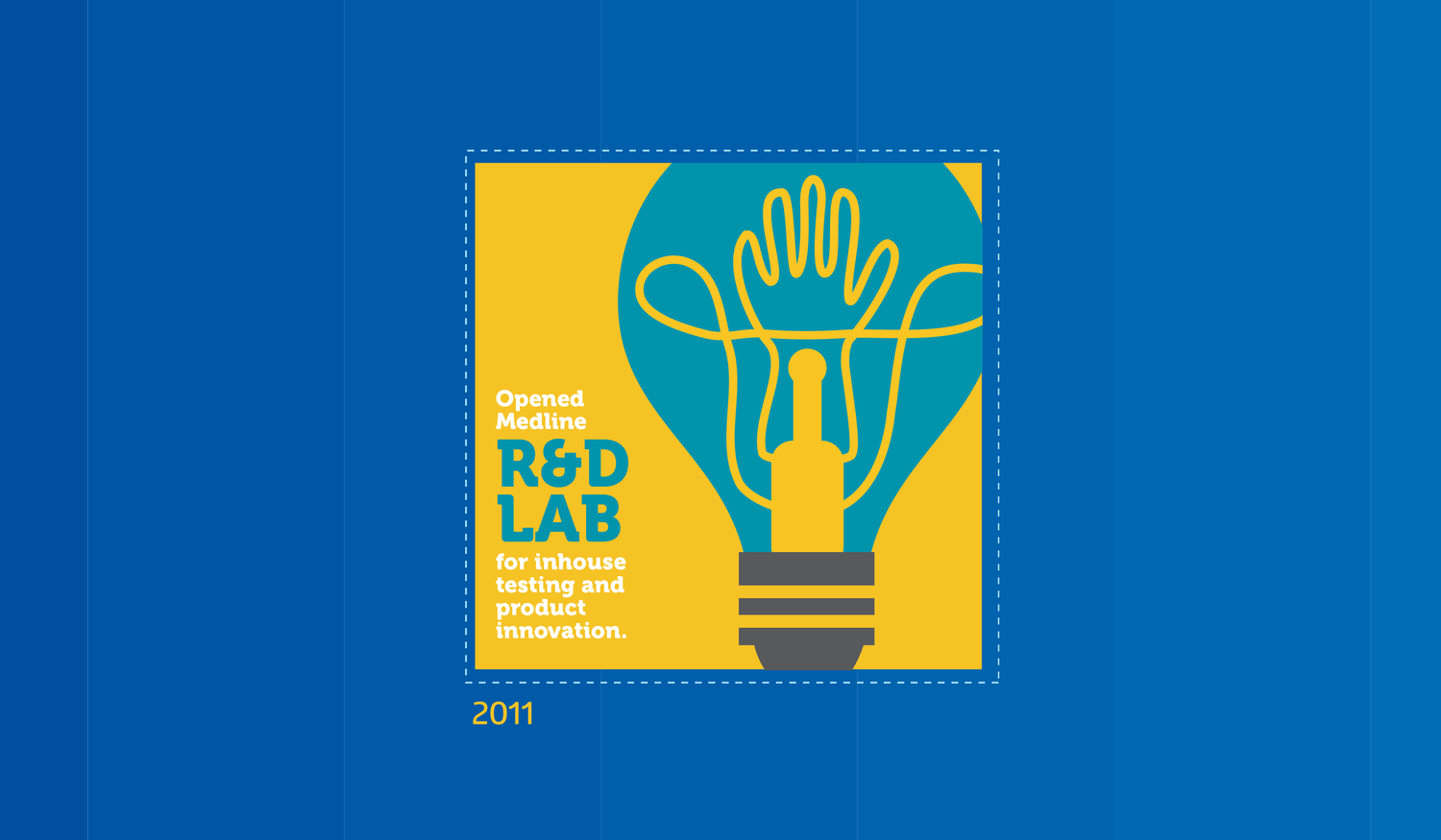
SPARKING NEW IDEAS. To highlight the opening of Medline’s R&D lab in 2011, the tile uses a lightbulb intertwined with a glove—a nod to the constant innovation behind medical product design. The concept symbolizes experimentation, invention, and ideas brought to life.

THE POWER OF RENEWAL. This 2012 tile represents Medline’s reprocessing service, where used devices are cleaned, tested, and restored to like-new condition. A split-color background and directional arrows visualize the journey from old to renewed—reinforced by real surgical scissors layered on top.
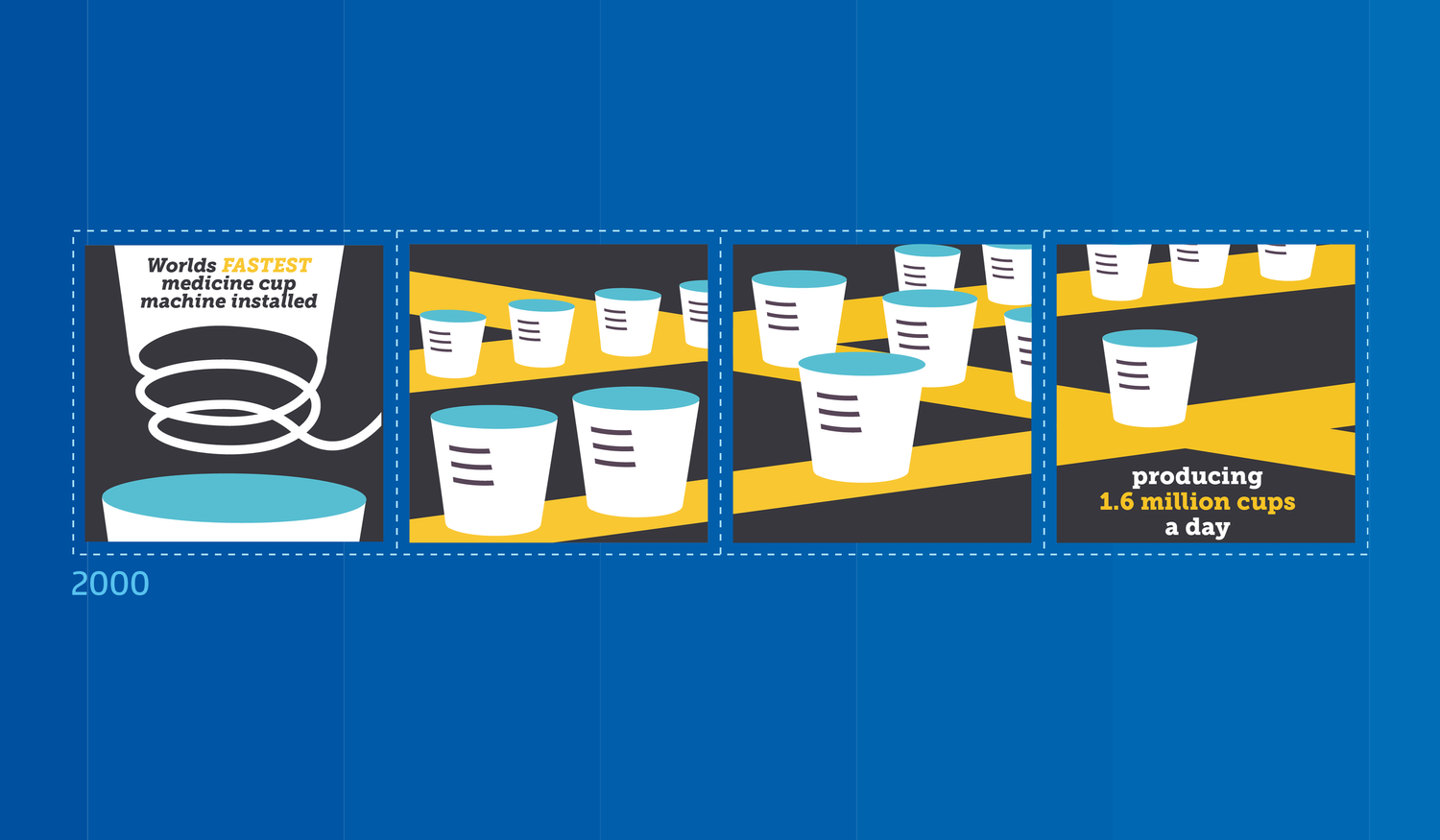
A MILLION LITTLE MOMENTS. This series of tiles celebrates the installation of the world’s fastest medicine cup machine—capable of producing 1.6 million units a day. A spiral line illustrates the creation process, while the assembly line visuals reinforce scale. Repetition across multiple tiles helps communicate the sheer volume and impact of something so seemingly small.

SEEING THE HUMAN SIDE OF CARE. To represent Medline’s entrance into the physician office market, I created a friendly, stylized doctor whose face is formed by a stethoscope—merging function with warmth. The simple shape hints at both clinical tools and human connection, a nod to the personal nature of outpatient care.
Medline Product Wall
-
Medline needed a large-scale wall graphic to showcase the breadth of their product portfolio—everything from PPE and IV components to surgical tools. The goal was to create an engaging, informative installation for their corporate campus.
-
The challenge was creating a layout that felt both expansive and cohesive. With so many products represented, it was important to find a visual rhythm—balancing scale, spacing, and flow to keep the viewer engaged without overwhelming them.
-
Using illustrations created by another designer, I developed the overall composition—grouping products by category, adjusting scale for visual hierarchy, and weaving in branded phrases to add storytelling layers. I built the final design in Illustrator with careful attention to alignment and balance.
-
The wall became a visual centerpiece on Medline’s campus—highlighting the company’s wide-ranging capabilities through clean, organized design. It helped reinforce brand pride and product diversity in a striking, memorable way.
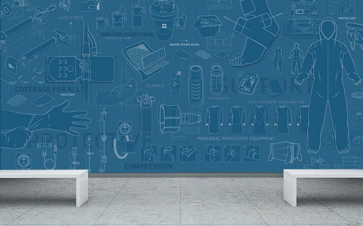
BUILT FOR BALANCE. A dynamic wall installation created for Medline’s corporate campus. Existing product illustrations were reimagined and arranged to create a visually balanced, layered composition—bringing order, rhythm, and brand storytelling into the space.

THE ART OF FUNCTION. Using technical drawings from Medline’s product catalog, I developed a large-scale layout that highlights the breadth of their medical offerings. Each element was carefully placed to create visual interest while celebrating real-world utility.

DESIGN IN MOTION. This piece transformed flat reference art into a flowing wall feature. I curated, scaled, and composed hundreds of detailed illustrations to create a cohesive design that moves the eye—and celebrates the everyday tools that keep healthcare moving.
DNA Illustration
-
Progenity’s Ann Arbor office needed a visual element that would instantly communicate the space’s focus on DNA and scientific research. The goal was to energize the environment and reflect the company’s expertise in genetics.
-
The concept needed to feel both scientific and brand-aligned. I wanted the design to clearly represent DNA while incorporating elements that spoke to data, research, and innovation. Color, structure, and subtle storytelling would all play key roles.
-
After initial phone consultations with the team, I began researching and sketching. Once the concept was approved, I moved into Illustrator to create the final artwork. The graphic follows the structure of a traditional DNA strand, with binary code woven into the design. Toward the end of the strand, the word “bioinformatics” is spelled out using the binary system. Brand colors were used to maintain consistency with Progenity’s identity.
-
The final wall graphic transformed a plain glass surface into a bold, purposeful installation. It communicated the room’s intent at a glance, reinforced brand messaging, and added a thoughtful layer of design to the workspace.

DESIGNED FOR IMPACT. Shown here pre-installation, the artwork combines data-inspired visuals with Progenity’s brand palette and key genetic language. The strand structure, binary code, and word elements were all designed to reinforce the team’s focus on bioinformatics.
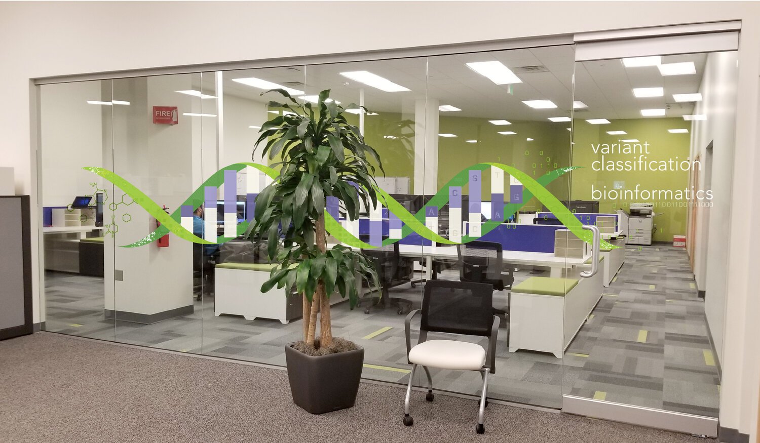
BUILT FOR GLASS. Designed specifically for vinyl application, this DNA-inspired graphic was installed across a glass conference room wall at Progenity. The transparent material allowed the design to interact with light and space—creating a seamless integration between science and environment.