

Remedy Phytoplex
-
Remedy Phytoplex is where clinical science meets skin nutrition—a skincare system known for both performance and care.
The challenge: create a catalog that educates, inspires, and builds trust. It needed to clearly communicate the product system while bringing warmth and confidence to every touchpoint.
-
Lead with clarity and consistency. I mapped out structure, sketched ideas, and pitched concepts to align with the brand’s tone and product hierarchy. The visual system had to be informative, approachable, and flexible enough to expand across all future materials.
-
I developed a cohesive visual identity across packaging, marketing, and sales tools.
This included layout design, custom graphics, dielines, and illustrations, as well as art direction for photoshoots. I sourced props, directed styling, and partnered closely with the copywriter to ensure clear, credible messaging throughout.
-
A 64-page catalog that became the foundation for all Remedy Phytoplex print materials—unifying the brand across clinical, marketing, and retail touchpoints.
AT-A-GLANCE INTRO. A high-level print ad designed to introduce the full Remedy Phytoplex system at a glance—clean, clear, and easy to absorb.

CATALOG SNAPSHOT. Selected spreads from the Remedy Phytoplex catalog, highlighting key products and ingredients with a clean, clinical layout.

CLOSER LOOK.

SYSTEM SNAPSHOT. Here’s a peek at how it all comes together. This snippet shows the system behind the catalog, color-coding by product line, a clear layout, and consistent pacing throughout.
BRANDED TEXTURE. Originally created for the catalog’s back cover, this design naturally evolved into a branded texture. Its subtle integration of circuitry and leaves became a unifying element across the Remedy Phytoplex line, reinforcing the “Science + Nature” story in a quiet but consistent way.

DESIGNED TO MAKE AN IMPRESSION. My task: design a leave-behind that left a lasting impression. This kit introduced the Remedy line with a focus on trial, education, and feedback. It included product samples, posters, greeting cards, and evaluation tools—packaged to stand upright for easy display and maximum visibility. I sketched concepts, refined ideas, and partnered closely with the vendor to bring every detail to life.

TAKE A CLOSER LOOK AT WHAT’S INSIDE. This hands-on kit brought the Remedy line to life—literally. Packed with product samples, evaluation tools, posters, and greeting cards, it was designed for trial, education, and trust-building. Displayed upright for visibility and impact, every element was sketched, refined, and built in close collaboration with vendors.
TRADESHOW PRESENCE. Real-world execution of the Remedy Phytoplex booth. Designed for visibility and impact, bringing the “Science + Nature” story to life at scale.

A MESSAGE YOU COULD FEEL. This interactive mailer illustrated how Remedy Cloth replaces a 4-step routine with just one. Each flap slowed the reader down—until a follow-up arrived with a single, effortless open. It was designed to spark curiosity, highlight efficiency, and get reps talking.

PRODUCT SHEET. Designed to make the science approachable and the benefits clear—fast facts, clean visuals, and a layout that supports easy understanding.

TRAY ARTWORK. Pulled directly from the Remedy catalog and packaging system, the tray design uses consistent fonts, graphics, and messaging to build trust and reinforce brand recognition.

ADDING WARMTH. To move Remedy beyond a clinical feel, we introduced softer fonts, richer colors, and skin-focused imagery—creating a brand that felt human, emotional, and still professional.

BRINGING THE SYSTEM TO LIFE. With the new tone in place, I extended the updated Remedy look across multiple product tiers. Essentials and Phytoplex were clearly differentiated—yet visually connected through consistent layout, structure, and messaging. The design balanced clarity with care, guiding customers while reinforcing trust at every touchpoint.

REMEDY ESSENTIALS. A bold, benefits-forward ad showcasing Remedy’s color-coded system in action. The overhead shot and clean layout make it easy to see what’s offered and how each product fits into care routines—fast, visual, and sales-ready.

TRY IT FOR YOURSELF. This Remedy Phytoplex display was designed to encourage hands-on interaction. Skin-focused imagery adds warmth and trust, while the messaging invites trial and personal connection.

STICKING POINTS. Clingable posters created to draw booth traffic without the need for tape or setup. I partnered with the copywriter on messaging, sourced materials, and managed vendor production. Bold, playful, and hard to miss.

CREATING BUZZ. The design was simple—and seriously effective. These posters generated so much interest that competitors were tearing them down. Booth traffic spiked, curiosity grew, and the Remedy story got noticed.

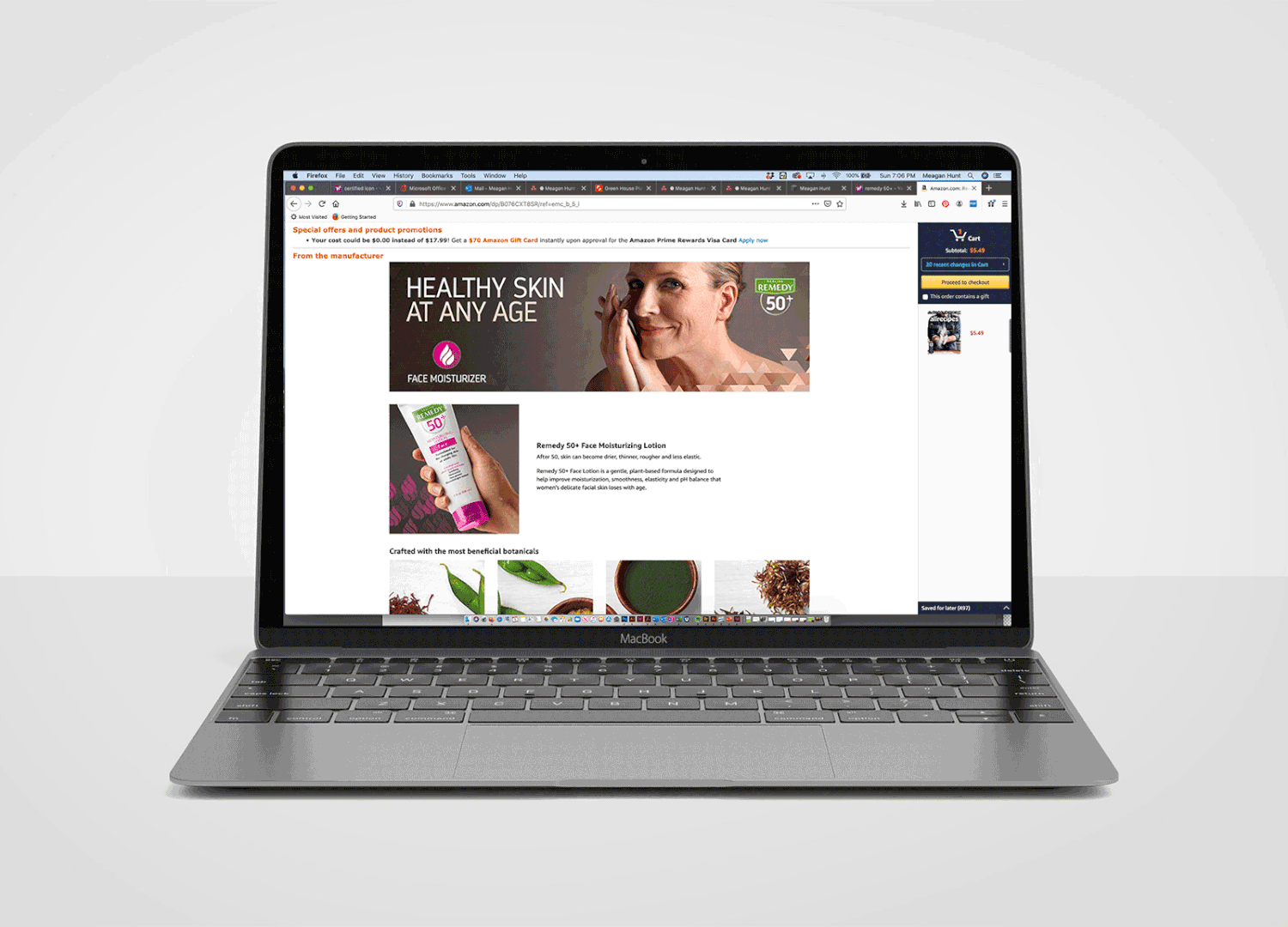
REMEDY 50+. A banner introducing a plant-based face moisturizer for aging skin. The layout blends science and softness—transparent layers reflect evolving skin needs, while a clean grid adds structure. Soft lighting, minimal makeup, and an earthy palette keep the tone grounded and real.

FINAL LOOK. The Remedy 50+ product banner delivers a confident finish, showcasing the full line in one elevated, unified shot. An upward angle suggests strength and reliability, while color-coded icons support easy navigation and reinforce the science-meets-nature story.
LIVE ON SITE: These Remedy 50+ banners were featured across digital platforms, reinforcing the brand message with warmth, clarity, and cohesion.


